Introducing Color Pal — pick consistent colors for your design system
Prototype**Begin mock press release**
November 25, 2023
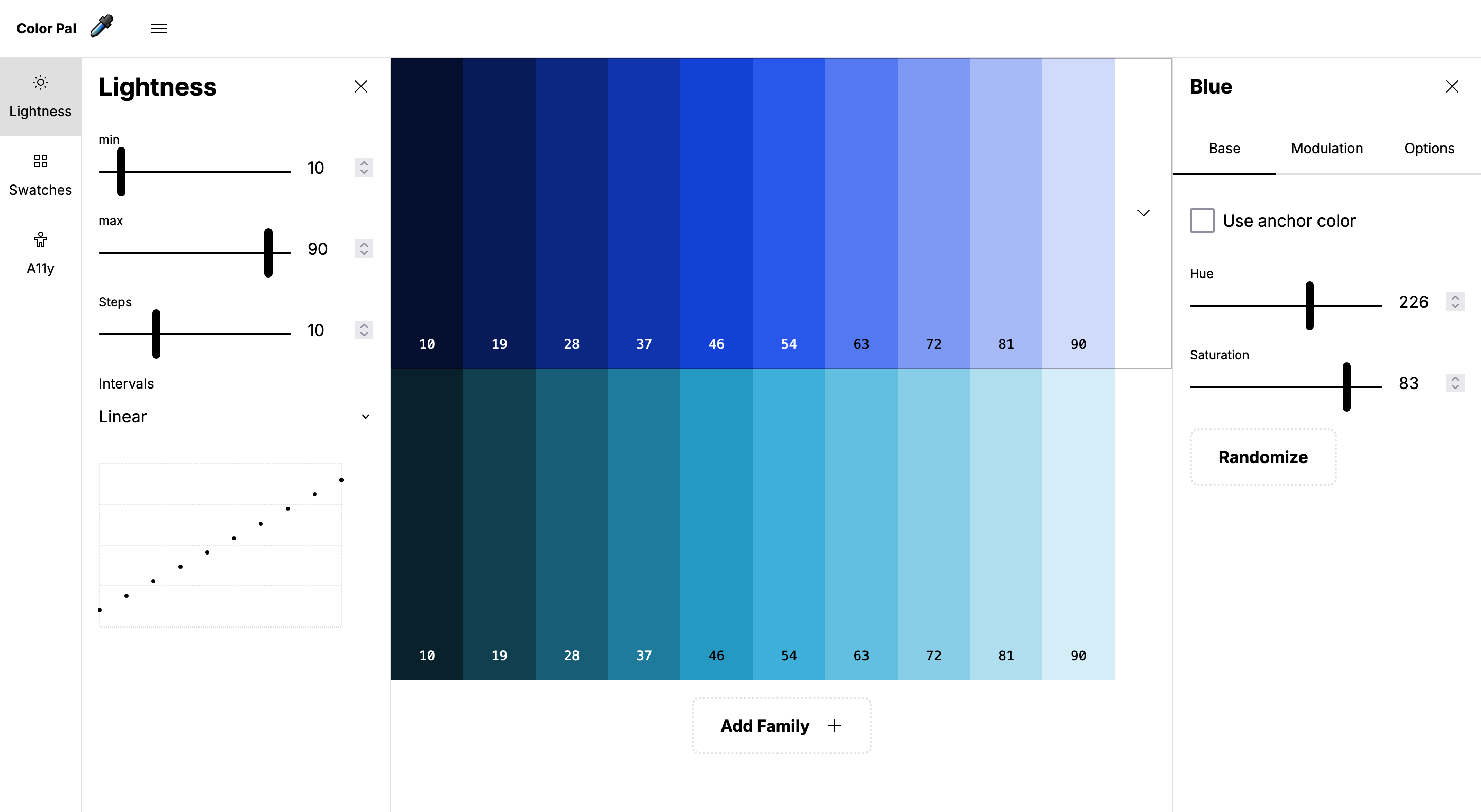
APPLETON, WI, US — Color Pal enables a systematic approach to colors, producing a consistent aesthetic. With Color Pal it’s easy to play with colors, test accessibility, and export everything to code and other design tools.
While private label design systems often force you into a predefined number of color families and shades of lightness, fully custom design systems require manually choosing colors. But choosing consistent colors is a tedious job using today’s design tools. A small tweak needed in brightness can require hours of reworking everything.
Color Pal immediately lets designers start building their own color system. They can add as many color families as they choose. They can adjust their system’s rules by choosing how many steps of lightness are needed and the darkest and lightest tones. They can also test out text contrast ratios simultaneously with every color to ensure WCAG accessibility. They can name each color family and even apply hue and saturation shifts to individual families. When they are satisfied with their colors, they can then easily copy and paste the swatches into their favorite design tool as an SVG, or instantly share all the values with their dev team as CSS.
What designers are saying about Color Pal:
This is awesome!
This is wonderful!
I love the color palette tool!
This is dope.
This is really awesome
LOVE it!
Visit color-pal.com and start building your color system. No accounts. No paywall. Just colors.
**End mock press release**
I wrote that press release kind of for fun, but also because I thought it would be interesting to try to think of this tool from a product strategy standpoint and not just trying to build something useful. Anyways, Color Pal is really fun to play around with and you should go do that now… but if you’d rather just read about it, here are the highlights:
Control lightness parameters across every color family
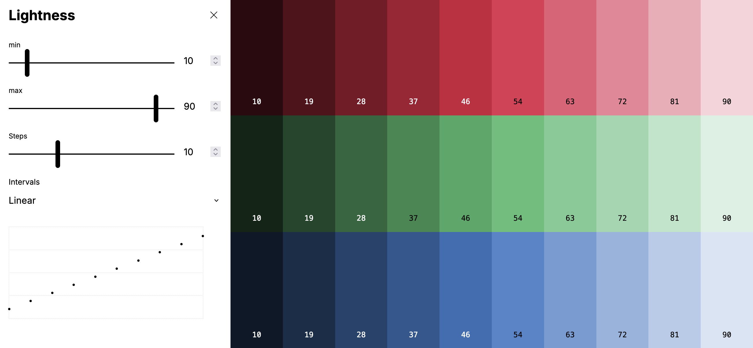
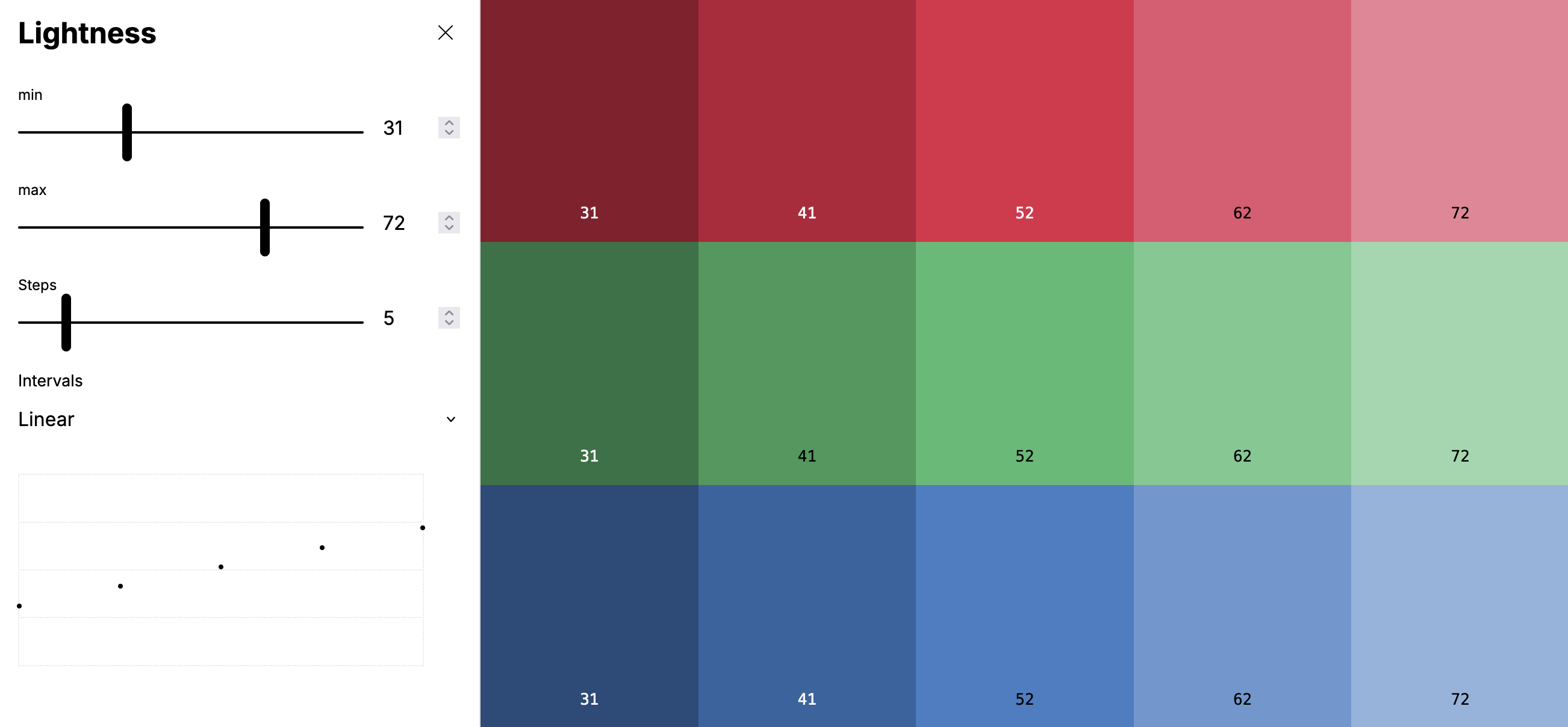
The main reason I built Color Pal was to solve this simple problem — adjusting the overall lightness of all your color families (and changing the number of steps) is insanely tedious in a tool like Figma. The tool lets you instantly adjust lightness for every family while keeping everything perfectly consistent.
Fine tune your families
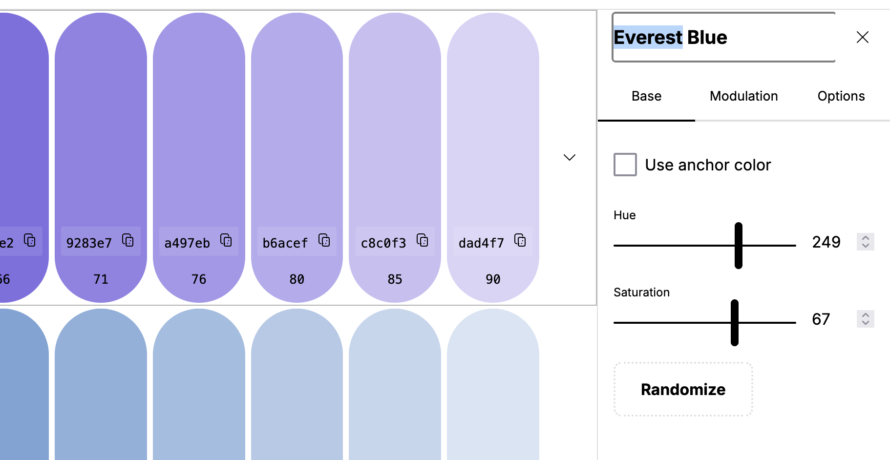
If you’ve read my opinion on naming color families in design systems, you’ll know I’m a big fan of having unique color names. Beyond that of course there is hue, saturation, randomization, and modulation. I wanted as much customization as possible for each family while still enforcing consistent global parameters.
Quickly get the colors into [Your Design Tool] or CSS
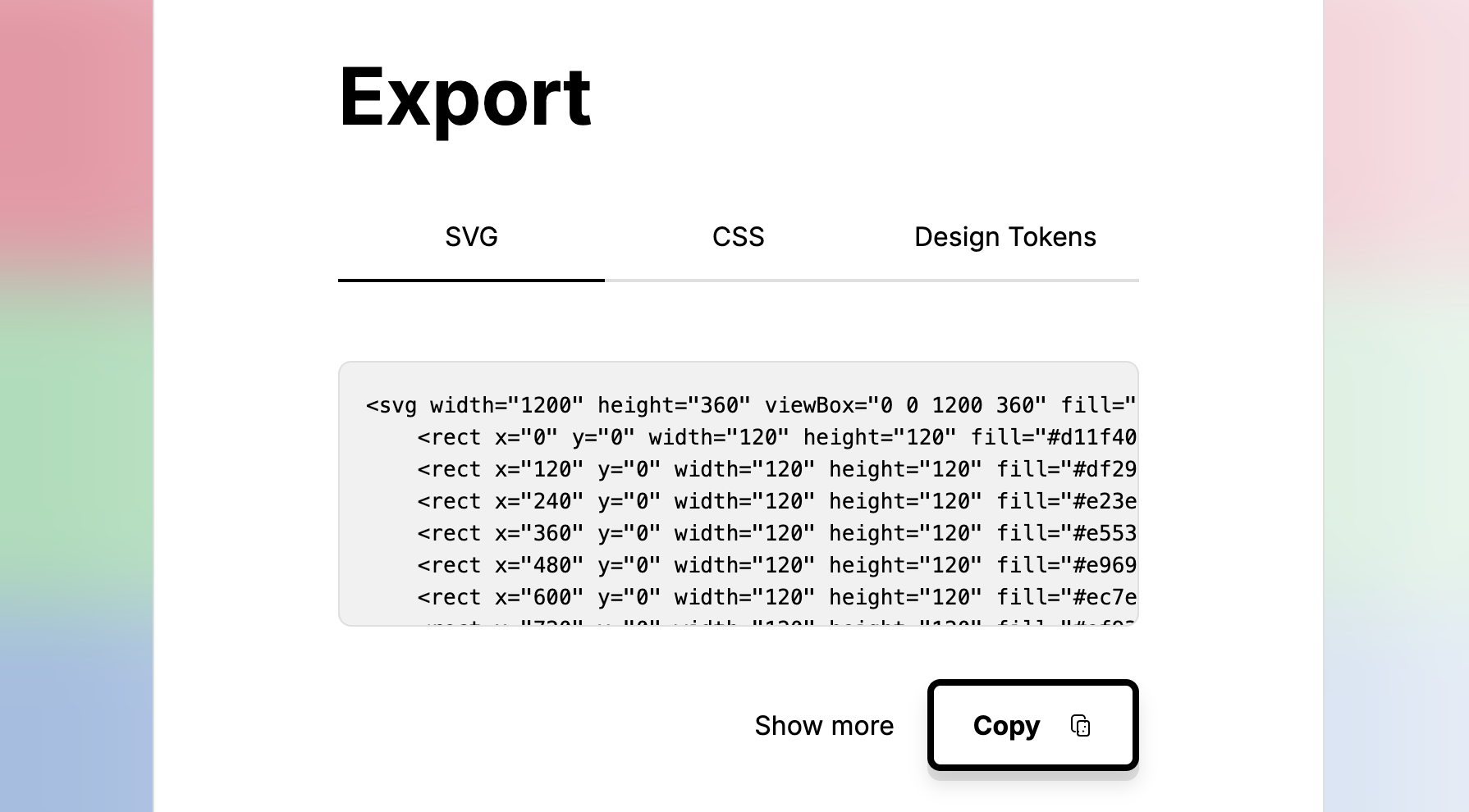
The fastest way to get your colors is just copy and pasting the SVG data directly into PenPot or Figma or whatever design tool you are using. Obviously having all this data available as CSS variables is helpful too from a development standpoint.
I’ve also been watching from afar, the community effort to build out a design token standard. I know it’s not finalized yet, but I wanted to include it to help raise awareness. Also hopefully at some point design tools will allow importation of this format, and having your colors immediately tokenized would be very nice.
Check text contrast ratio ratings
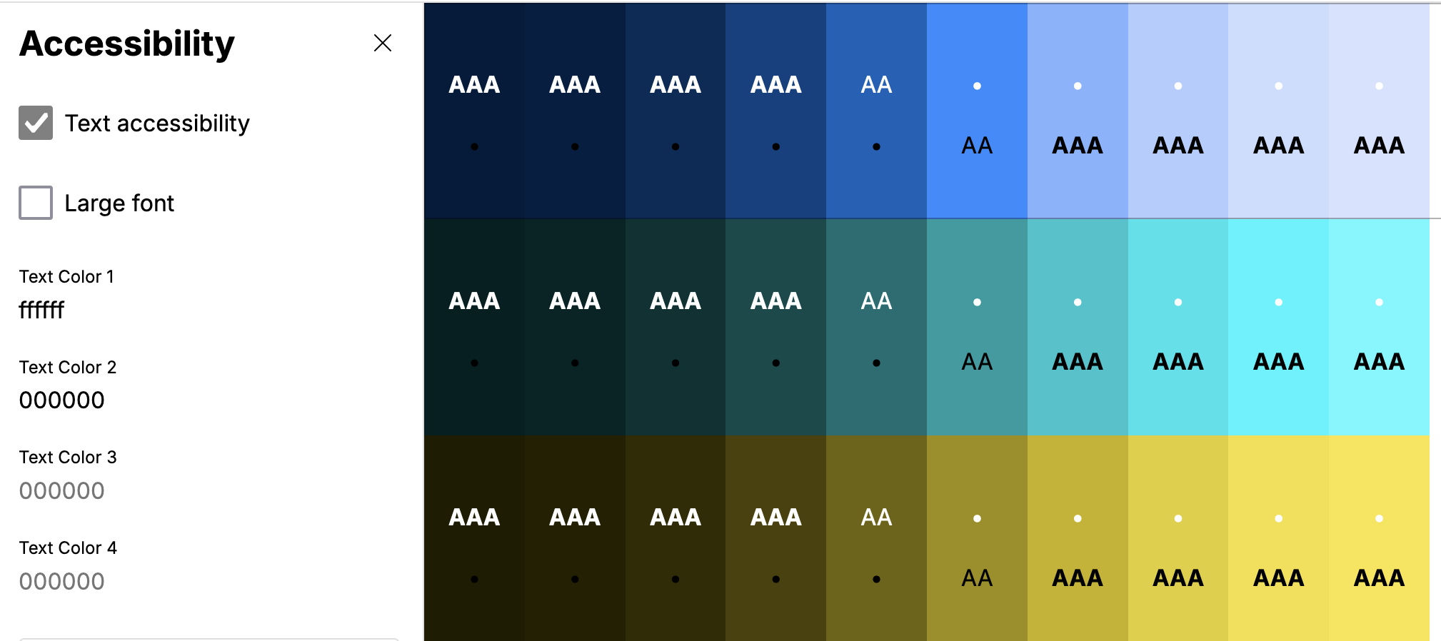
I wanted a way to immediately see the contrast ratio of text as I played with colors. The tool allows you to add up to four text colors, and see if they pass the WCAG contrast ratio standards. You can also toggle between regular and large text.
Fin
I didn’t include much about my process for developing this tool, but I did want to say a huge thank you to all the designers that offered their feedback. It was instrumental in helping me iterate to make this tool what it is today.
And finally, just in case you made it this far without checking out the tool. Go check out Color Pal now, and let me know what you think! I’d love to hear your feedback.
Posted November 25, 2023