Naming in a Color System
Design System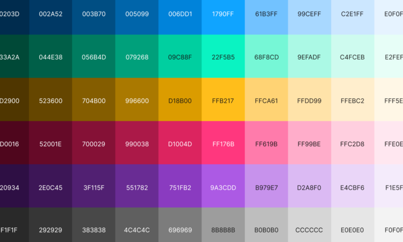
Naming colors in your design system is an important part of ensuring your team reaps the benefits of having a design system in the first place. A good naming convention helps your design team communicate better internally, but perhaps more importantly it should leave less room for error during the front end development. So, how should one go about naming all the colors?
My main philosophy behind naming colors is the idea of anti-fragility— that a well designed system can handle changes from outside forces. Expect to add colors to your base palette. Expect your brand colors to change. Expect you’ll need to add another shade. All of these scenarios can really mess up your naming conventions and cause a lot of confusion in a codebase if you aren’t thoughtfully naming colors. What chaos will ensue if you are forced to redefine what blue-0 means?
Naming, conventionally
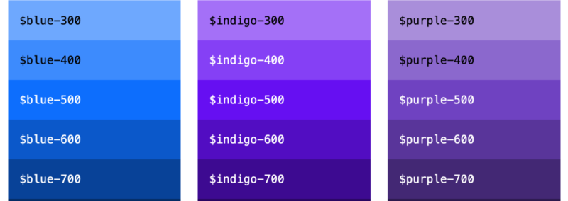
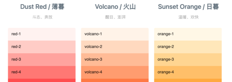
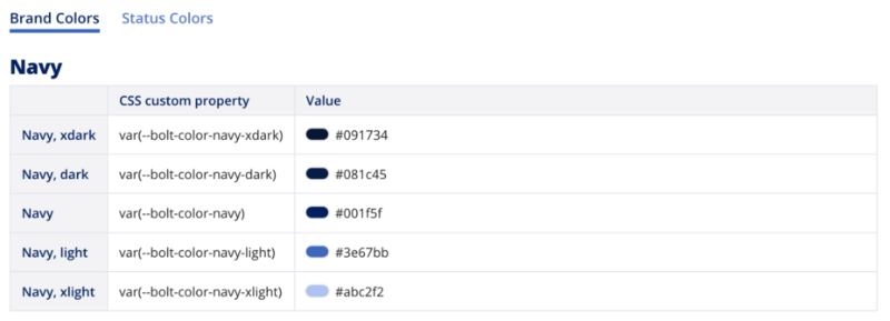
It is difficult to pin down any industry standards for how colors should be named. There are a lot of different ways that teams handle this question, and it’s no wonder… naming is a notoriously difficult thing to do. With all the different conventions I’ve seen, none have really stuck out to me as having a compelling reason to follow suit. Here’s a quick line up of color systems that use differing approaches.
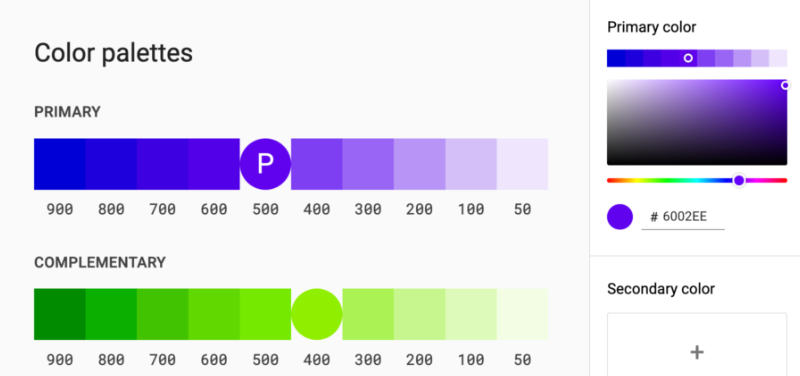
Automattic
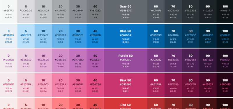
IBM
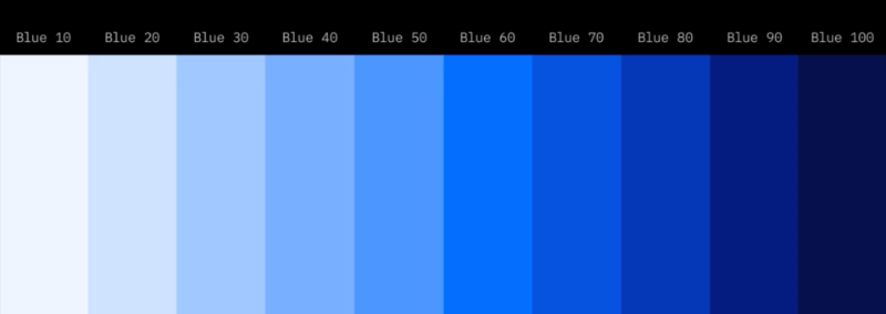
Bootstrap
Ant Design
Bolt Design Sytem
Common threads
Hopefully it’s obvious by now that we as a design industry haven’t agreed upon the best way to name the colors in our systems. You might have noticed that commonly systems will use lower numbers to indicate a brighter shade and high numbers for darker, but other than that there is not a lot of consistency.
blue-700, blue-80, cerulean-7, and blue-xdark are all reasonable names for a specific shade of blue, but every good system should have a why behind every rule. I’m not so sure any of these give a good enough answer as to why blue-700 is any more clear and consistent than blue-xdark.
Naming by Hue
My first point is that every hue in a base color palette should have a unique name. More unique than just ‘blue’ and ‘red’. ‘Cerulean blue’ for example is wordier, yes, but it is a much more specific description of a hue than just ‘blue’. This is important for two reasons that have to do with making your system less fragile.
One, you may need to add another hue of blue to your base palette, and suddenly there is a naming conflict. Is that the point you start to differentiate where you have just regular ‘blue’ and ‘navy blue’?
Two, you may need to scrap your current blue and change to a new one, which suddenly makes your source of truth less truthy, and perhaps confusing from a retrospective in your documentation and code repo.
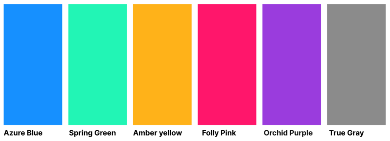
The easiest way I’ve found to arrive at a unique name for any given color is by using tools like this one: color-name.com . You can enter any hex value and it will give you a name. For example #9A3CDD is called “Dark Orchid”.
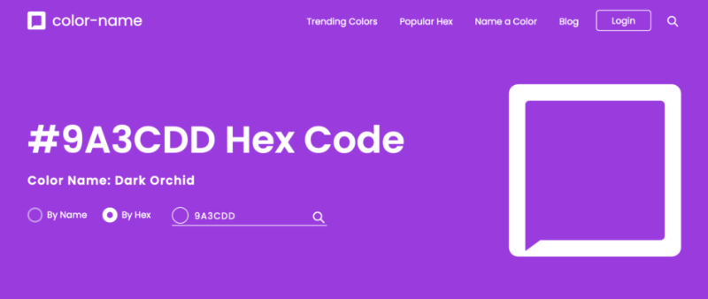
Sometimes these types of sites will spit out a name you aren’t crazy about. From the above screenshot, In fact, I’ll change ‘dark orchid’ to ‘orchid purple’; that way it’s a little easier to understand that it is a hue of purple we are dealing with, not any random color you’ve seen on an orchid. Either way don’t be afraid to come up with your own names too; the important part is that it is unique and there is a logical connection to what it is describing.
People have attempted to standardize the naming of colors, but with language’s fluidity, the sheer number of distinguishable colors in existence, and humankind’s cornucopia of perceptions, such a task is difficult (ask Crayola how they come up with their crayon color names).
Naming by shades
The next step is numbering shades. We’ve seen popular design systems all over the place on this one, but the best way I’ve come up with is simply naming based on actual value rather than an arbitrary scale.
Hue, Saturation, and Lightness — HSL is a different way to describe color from RGB, and it provides us with a very concrete value directly related to a color’s brightness/darkness. The hex code #1053D5 equals rgb(16, 83, 213) equals hsl(220, 86, 45). Most color tools can convert from RGB to HSL, but for fun, the math is pretty straight forward. Divide the highest and lowest values by 255 and then average. In this case, red is the lowest with 16 and blue is the highest with 213. So we have (16/255 + 213/255) / 2 = 45% lightness.
So I have this hue I am calling “Royal Blue”, and now I can anchor the name of this specific shade on lightness. Its official name becomes royal-blue-45. Unlike RGB channels having 255 possibilities, the lightness channel is 0 to 100, making the nomenclature readily obvious on a light to dark continuum where the shade lies.
This method is also much less fragile in terms of adding more shades. If you decide you need a shade between two established colors, you just add it in and label it accordingly.

Theming
My final thought about naming colors has to do with theming. I think there is an attraction to simply name colors by their semantic category. For example instead of using orchid-purple-55 wouldn’t it be simpler to just call it something like primary-action-color? At first blush, this method seems more straight forward, but it becomes problematic when you start using the color in ways that are not your primary action.
In the example below you can see how this “primary action” color is used on a button, but also for a border that does not have the same semantic meaning. If the primary action color ever changes, this would make it extra annoying to detangle which colors need to be changed and which need to be left alone.
<div class="card">
    <button class="main-action">
</div>
:root {
--primary-action-color: #9A3DCC;
}
.card {
border: 1px solid var(--primary-action-color);
}
.main-action {
background: var(--primary-action-color);
}To be clear, in the example above, defining the color with a semantic name, and then using that color in ways where the semantics do not matter, ie a border on a card, will only cause problems when you need to make a change. Instead name theme categories seperate from color names.
:root {
    /* Color definition */
    --orchid-purple-55: #9A3DCC;

    /* Theme definition */
    --primary-action: var(--orchid-purple-55);
    --background-border: var(--orchid-purple-55);
}

.card {
    border: 1px solid var(--primary-action);
}

.main-action {
    background: var(--background-border);
}
This distinction is important because leaving the color’s definition with a specific, unique name means that you can swap colors in and out of your theme with impunity, and worry much less about unintended changes.
Summary
- Choose unique names for your base palette
- Number your shades by HSL lightness value
- Avoid defining colors at a theme level
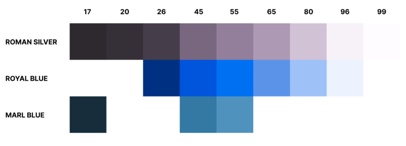
I’ll leave you with the colors and code I prepared for this site. Feel free to use.
:root {
    /* Colors */
    --royal-blue-26: #072F7D;
    --royal-blue-45: #1053D5;
    --royal-blue-55: #286AEA;
    --royal-blue-65: #6892E3;
    --royal-blue-80: #A5C0F3;
    --royal-blue-96: #EDF2FD;
    --roman-silver-17: #2C292E;
    --roman-silver-20: #343036;
    --roman-silver-26: #443D48;
    --roman-silver-80: #CFC3D5;
    --roman-silver-96: #F6F2F8;
    --roman-silver-99: #fefcff;
    --marl-blue-17: #1C2D3A;
    --marl-blue-45: #4677A0;
    --marl-blue-55: #5F90B9;

    /* Theme */
    --background-color: var(--roman-silver-99);
    --background-color-hover: var(--royal-blue-96);
    --shadow-color: var(--roman-silver-96);
    --background-color-secondary: var(--roman-silver-96);
    --background-color-secondary-hover: var(--roman-silver-80);
    --focus-highlight-color: var(--royal-blue-55);
    --focus-highlight-hint-color: var(--royal-blue-80);
    --text-color: var(--roman-silver-17);
    --link-color: var(--royal-blue-55);
    --link-color-hover: var(--royal-blue-45);
}
Posted February 28, 2022