User Management, Square One
Case Study
I designed a user management system for a health plan administration platform. I took time to understand who our users were, and what they needed to do their jobs. I worked closely with product and engineering stakeholders to build consensus around a solution.
Problem: Only engineers can create users
Adding a user to our platform required the skills of an engineer. It involved manually modifying a database and individually choosing permissions and writing rules so the new user couldn’t access information they were not allowed to see. Getting all those things right was time consuming and expensive but also critically important because this startup dealt with people’s Protected Health Information. It was painful. Everyone knew it was a problem, and as our startup scaled, the problem only worsened.
The three main problems were:
- We can’t add, edit, and remove users
- We can’t control what data a user is allowed to see
- We can’t set what users are allowed to do
Number one was easy enough: authentication in our system was handled by a third party, so there were very few concerns (No flows were required for setting passwords, multi-factor authentication, recovery methods, etc.). But the complexity of our platform made the later two items especially tricky.
Many roles, each with unique access requirements
What made this particular problem unique and complex was hidden inside items two and three— the diversity of roles that needed to be accounted for, the sheer number of permissions available within the product platform, and the varying needs for restricted levels of access to data, ie. scope.
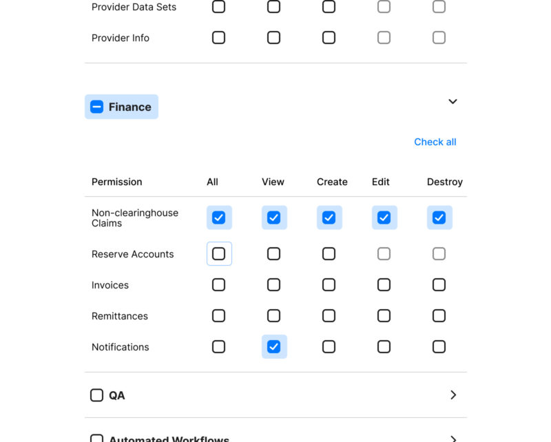
Initially my research to understand this problem started from a roles based perspective. I sat down with our product experts and we documented every single type of role that existed in the product platform. There were a few dozen, and we plotted out the permissions and scope for each role. As we built the list, a natural delineation emerged. It was less based on the permission types associated with their role (as you might expect), but the scope of what data they were allowed to access based on what type of organization they belonged to. This natural grouping would later come in handy.
This grouping of user roles also revealed another aspect of the problem: who will actually be completing these tasks of managing users? At first glance, the answer was internal to our organization: our IT Administrators and Account Managers. However the vision for the product platform was to accommodate our users onboarding their own customers, as users within the platform. This meant that there was also a matching delineation between the admin user types and what they would be allowed to do when adding new users.
Team collaboration resulted in many iterations of wireframes
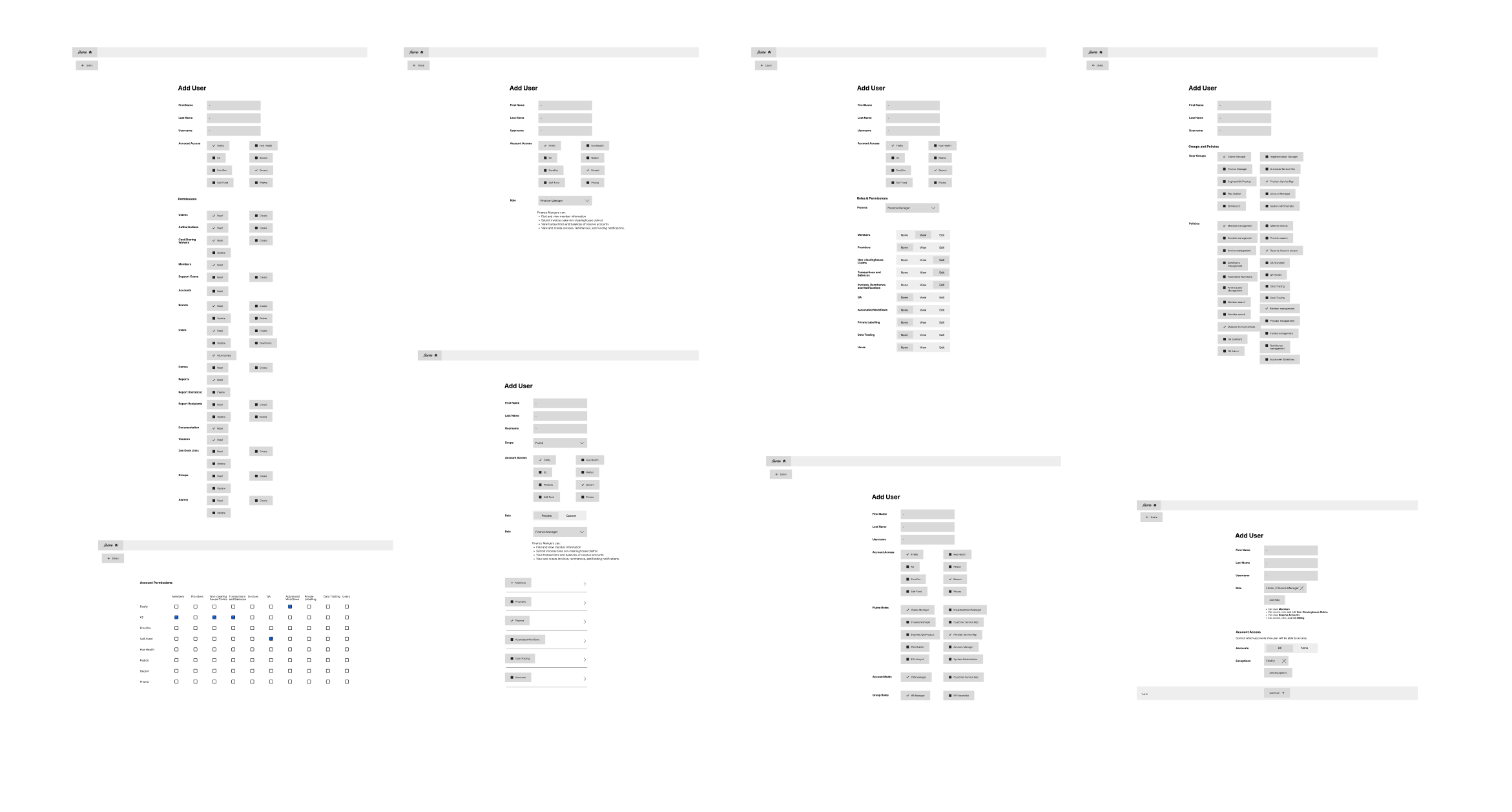
I started with brainstorming potential ways we could approach a solution. Before moving too far in any one direction, I spent time discussing ideas with our engineering and product teams. We coalesced around the idea of creating user categories based on how broad their access to data would be.
Grouping new users by access level rather than roles
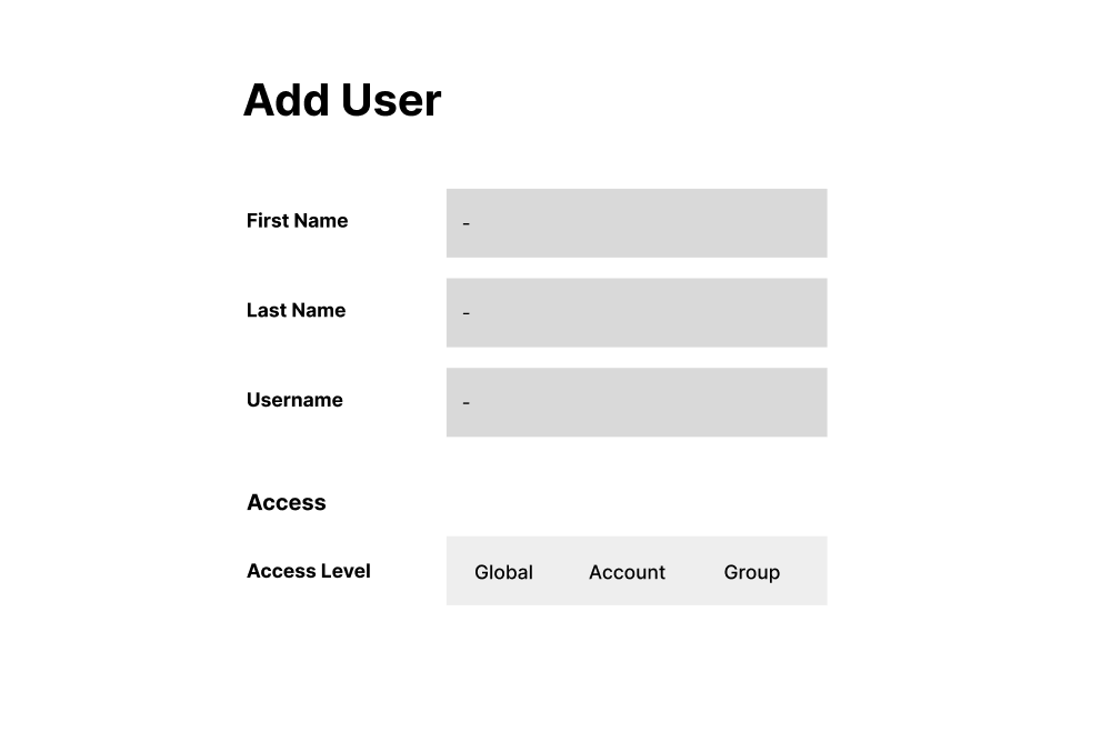
The main benefit of grouping user types by scope, instead of permissions, was reducing the chances a user would accidentally be given access to something they weren’t allowed to see. Another benefit was that this tiering of users would only show the relevant roles available, reducing the cognitive load to process which set of permissions would be needed.
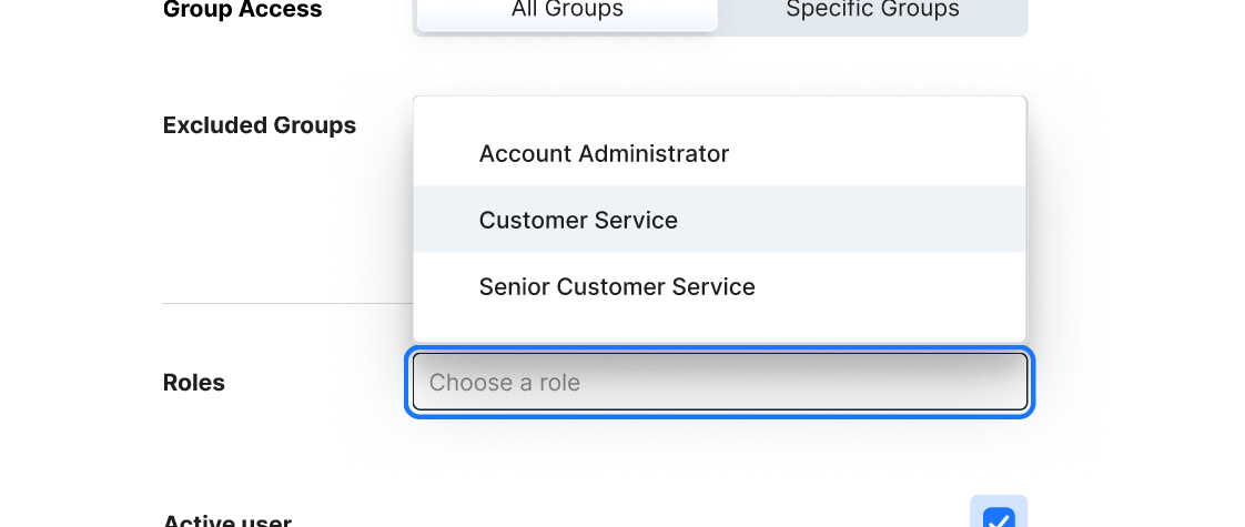
Another positive benefit to tiering user types, is that when it came time to set scope it would be much easier to set a scope that was appropriate for that user, and not accidentally allow them to see data they were not allowed to see.
The risk was that our naming system might be confusing, and could potentially create more confusion. So we took note that this would be an area to focus on in our usability testing.
Documenting micro tasks & distinct user flows
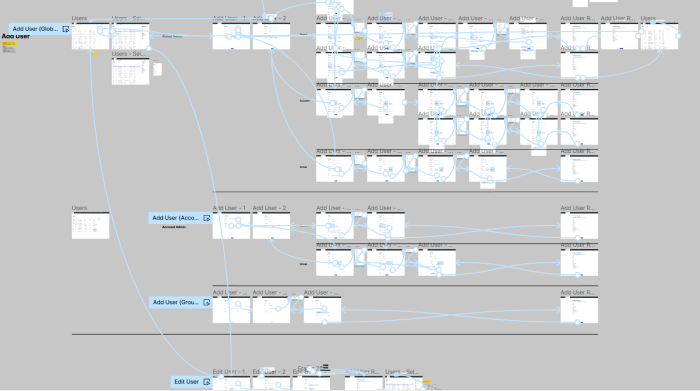
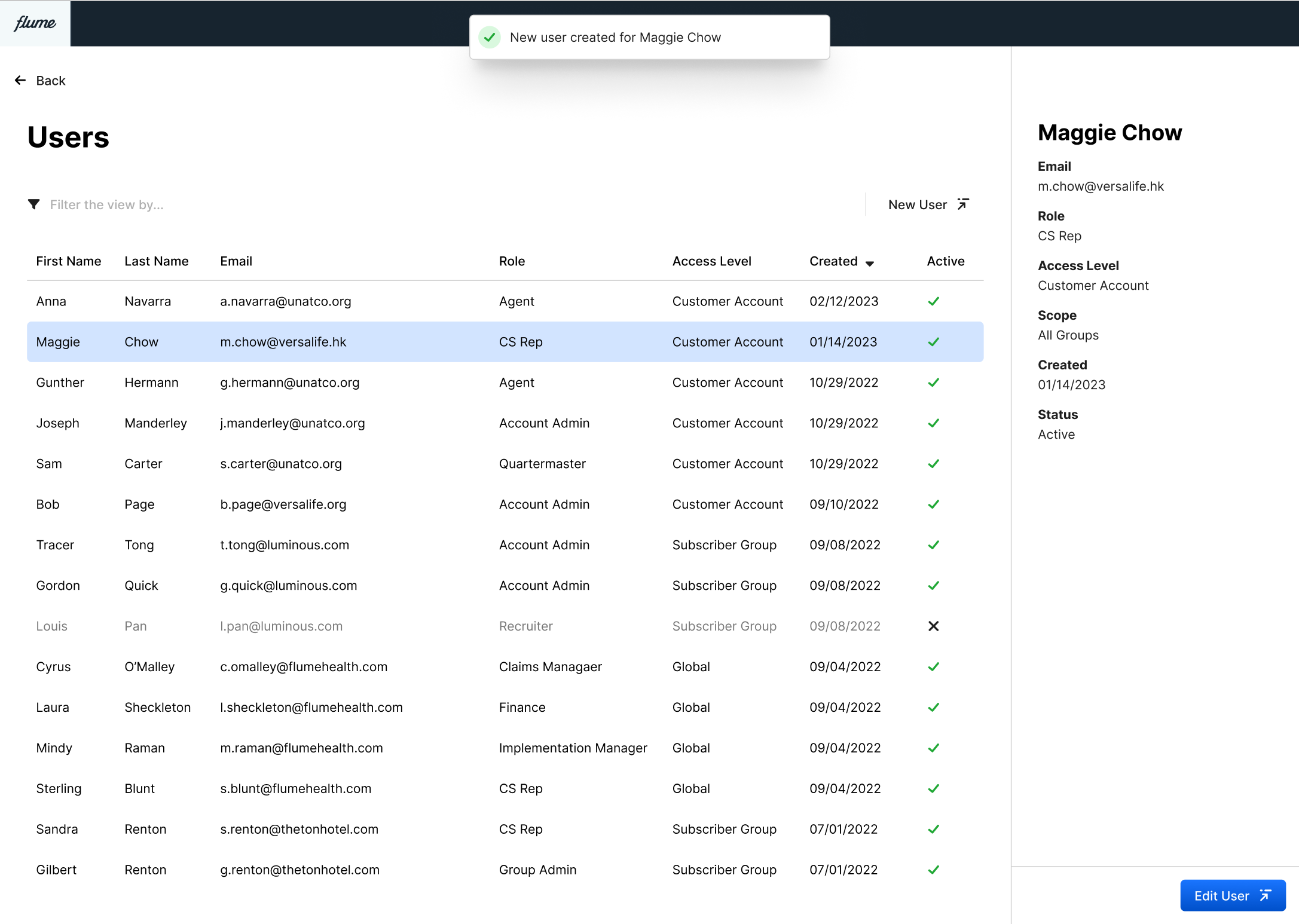
With the team behind this concept, I started to build out the specifics of the task flows. There were two important ideas I needed to keep in mind. The first was making sure to capture all the micro tasks that add up to being able to complete a task. For instance the task of editing a user, would include things like selecting a user from a list. Initiating the edit process. Changing data. Saving the edits, etc.
The other important idea was showing flows from the varying user perspectives. The type of admin would make a big difference on the permissions and scope they would be allowed to give to a user, and so this also would need to be captured in the designs.
I created high fidelity prototypes
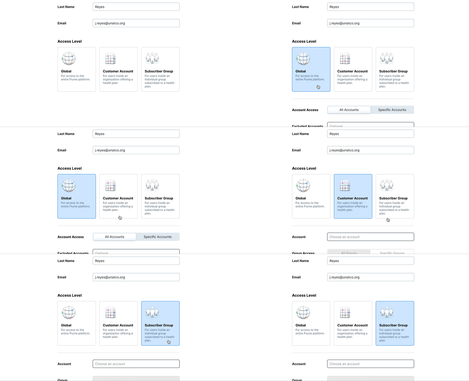
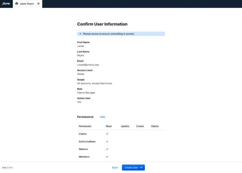
My next step was putting together the flows into a prototype. Because we tiered user types, this meant that the form for creating and editing users would change depending on the user type. Different permission sets would be available and differing levels of scope would be able to be selected.
New components for the form
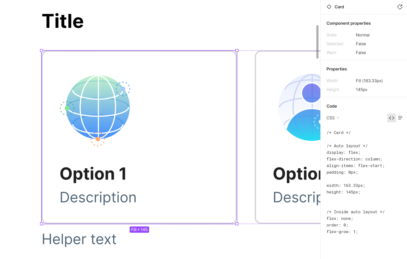
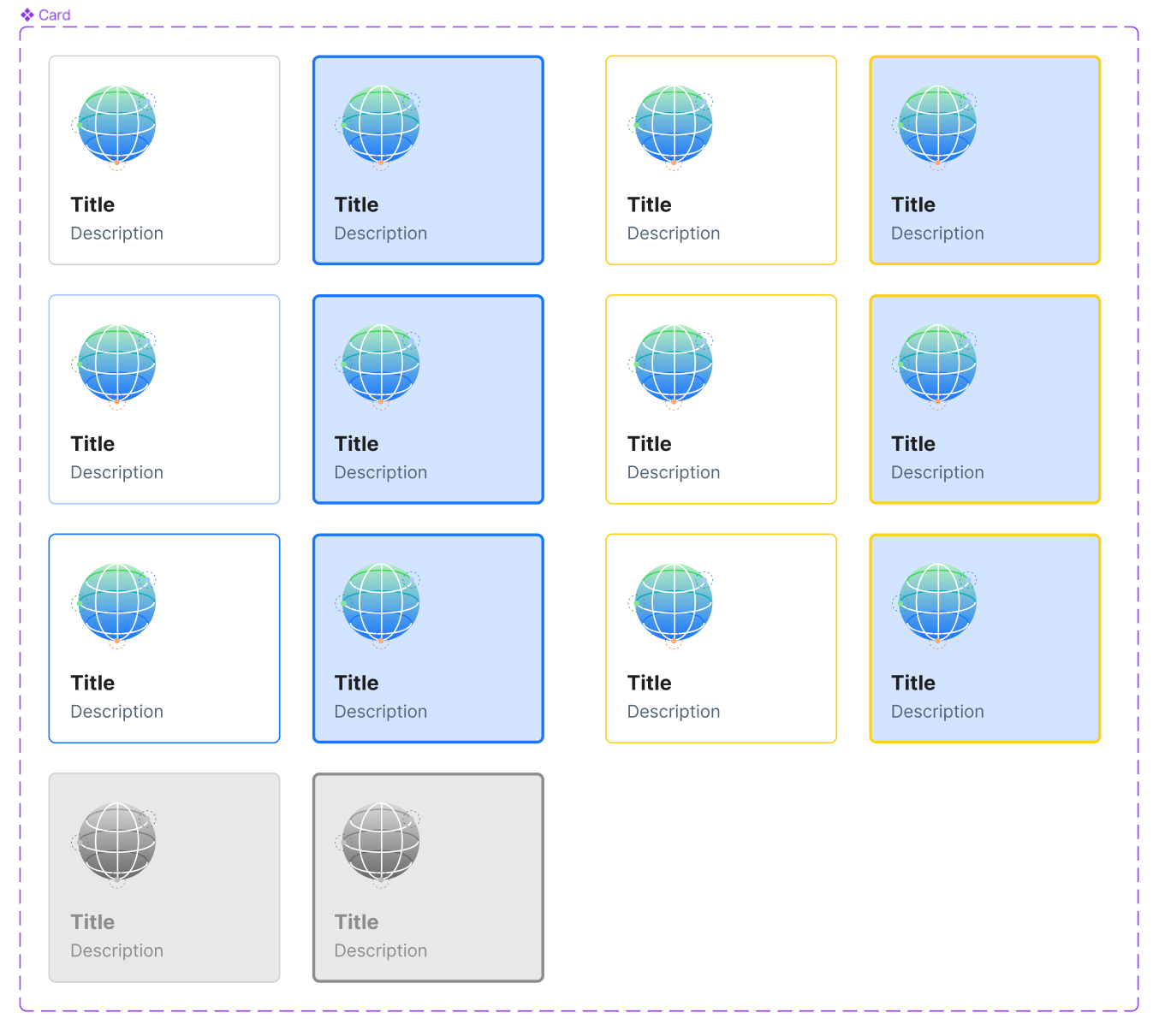
Our design system had many basic elements of a form, but with this particular choice carrying so much importance we decided we would need a new component that allowed for more context for the user to be able to make a decision— the Card Select.
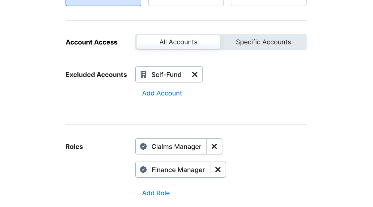
When it came to defining a user’s scope we also realized there would be a need for a more complex element: a multi-select. This would allow administrators to choose mutiple accounts for a user to have access to. Beyond this another interesting problem was the question of scope inclusion and exclusion. The segmented control seemed like the best way to ensure any set of rules could be enacted for a user’s scope.
To stay Agile, we boiled down the scope of work
As I built out all the flows involved in this effort, it started to become clear that the body of work from an engineering perspective was too large to be considered Agile. While our engineers worked on the design of the backend architecture, I lead a discussion with the product team to determine the smallest piece of work that would make this valuable to our users and the business.
We decided our first cycle of work would be focused on our internal users, so I recruited our IT and Account Admin folks to do a usability test. We identified some rough patches in our form labels and were able to easily fix this. Otherwise we felt we had the green light.
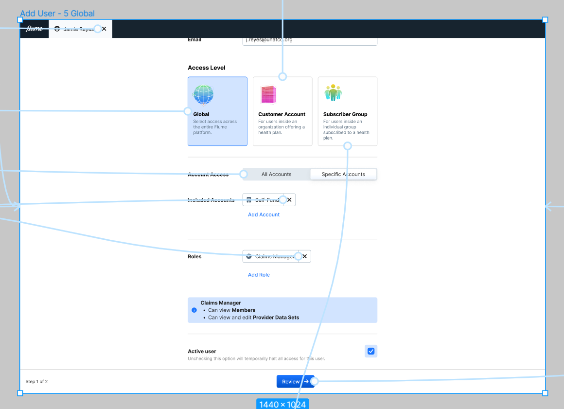
I went back and created a final “MVP” design spec to make sure our engineers had clarity on the scope of work. I also helped our product owner create a technical flow chart that captured the logic of the complex form. We were ready to write job stories and acceptance criteria.
Summary
Our problem at a surface level seemed to be fairly straighforward. But it was important to spend time up front ensuring we understood the varying needs of the people we were serving. User research was critical to ensure we were solving our problem in the right way.
And, how do we know we solved the problem? For our first iteration, this was simple observation. Our engineers were free of creating and managing users. Our Account Managers were empowered to onboard new folks as needed. This sped up operations, and reduced distractions for our teams.
As we iterate, we fully expect to encounter obstacles and ways to improve. But spending time up front to clearly understand the problem and foster a shared team understanding was critical to ensuring we would build a usable solution.
Posted March 23, 2023