Jollygrams
Game Design
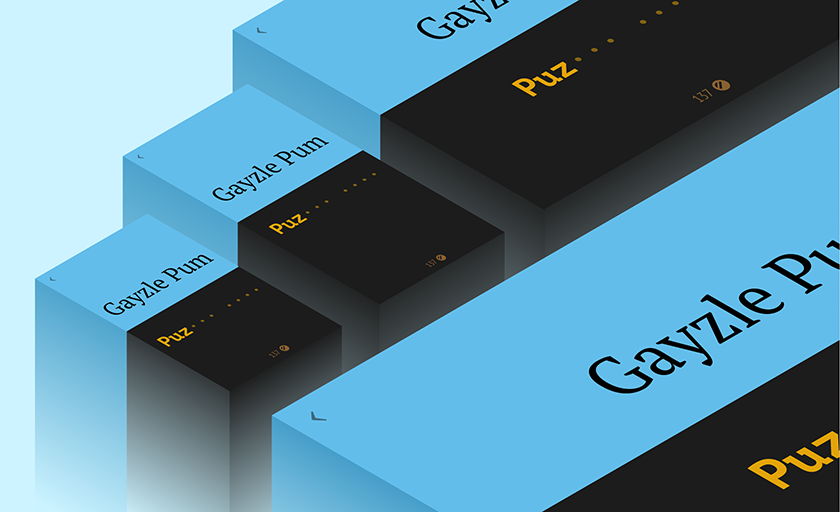
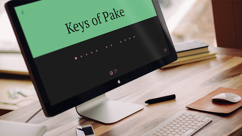
Jollygrams is a zany little word game designed for phones, tablets, laptops, desktops, and televisions.
Concept
The core gameplay involves players reading letters in unusual and bizarre arrangements, and trying to make sense of them. Legibility is always important, but here it was the key design challenge. Player enjoyment (and retention) rested heavily on how easy the puzzles were to read. My initial strategy was to attempt to build a set of rules that would govern the typographic ratios at any given screen size while still staying true to the classical principles of typography.
Research
I began researching how other word games handled this complex problem. Unfortunately, there were few examples of similar word games that could be played from a TV and a phone. Although many existed for phone and tablet, regrettably it seemed little attention was paid to the typography.
With little design precedent to stand on, I decided to dig into our library and refresh myself with the historical best practices and to see if these could be applied to and extrapolated on in the context of multivariate screen sizes. I also began passively searching for suitable typefaces.
Plan
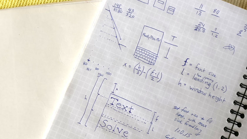
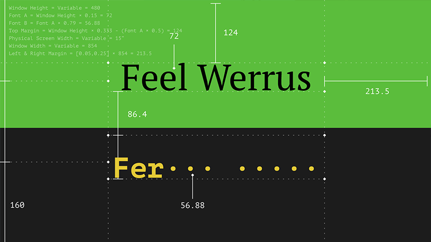
With my research in hand, I went about defining the ruleset for font size, margin, and line spacing based on screen size.

Implement
Next I worked with our developer to help write the C# scripting to implement these rules. We built the game with a tool that could compile to iOS and Android as well as PC so we’d be ready to deploy it to as many platforms as we needed. We picked a typeface and started testing.

Test & Iterate
Quickly we found that the mechanic of filling in the blanks didn’t work well when each letter was a slightly different width. On one hand, it was disorienting to see the line resize as the user typed; on the other hand, monospacing a standard typeface looked and felt wrong. The best solution was to find a pair of typefaces, one highly legible for the puzzle, and one monospaced typeface that would work for filling in the blanks of the answer. The solution came in the form of the PT font family, an open source family that has a great selection of non-standard characters as well as a fairly handsome monospaced typeface. We made some minor adjustments to the responsive ruleset and went back to testing.
Conclusion
We shared our beta version of Jollygrams with family and friends, observing and taking notes on the interactions. We tested with larger groups of people playing on a big screen TV and individuals playing on their phones. The feedback was largely positive. When it came to legibility, we were very satisfied with the results — the attention to typography paid off.

Posted June 1, 2017