Embellished Icons

Illustration

Sometimes icons need to be simple and clean. When they serve to assist in fostering quick recognition, simple is better. This is where icon libraries like Bootstrap Icons, Iconoir, and Font Awesome excel. They are monotone, made from basic shapes, and adhere to established patterns. And there are a lot of great, open source choices out there!

a set of 14 very simple geometric icons, including arrows, a checkmark, an alert, a text bubble, etc.
A simple icon set I designed for And the Consequences Were. It can be fun making these types of icons sets, but often times it just makes more sense to use an existing open source library.

But…. sometimes icons shouldn’t be so simple.

When icons are used to supplement content, the basic function is similar in that they support meaning, however there is an arguably more important function: to draw attention.

a view of Flume's website that shows a handshake icon above the title 'Get Started Schedule a Demo'
On this website I designed a handshake icon to further bolster the visual imporance of the page's call-to-action.

In these cases the content requires differing visual importance than straight text can afford. Enter the embellished icon. Here is a set I designed to be highly eye catching and colorful.
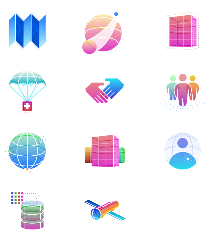
a set of 11 brightly colorful icons with smooth gradients and contour lines giving a three dimensional aesthetic.
This collection of icons is super colorful and provides a stark contrast to the monochromatic company logo. I stayed true to the design system and only used color swatches from the system’s color palette.

More flourish and detail adds flavor, supports brand cohesion, and sets an overall tone. Embellished icons are as much an illustration as they are a symbol.
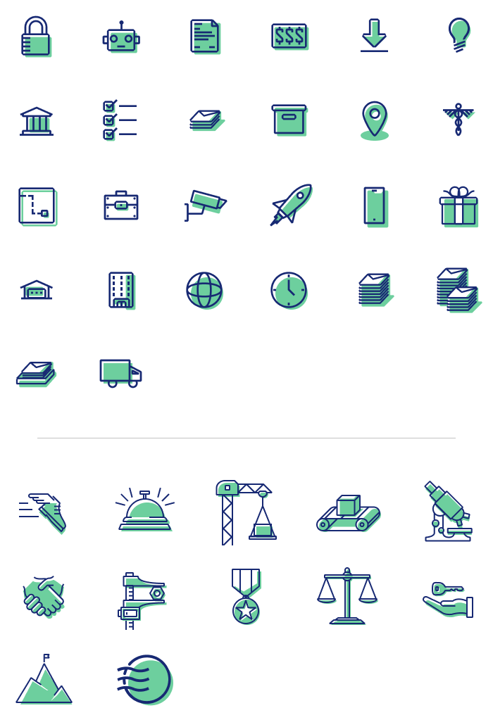
a set of twenty-six small icons and twelve slightly larger icons, that are duo tone. All the icons involve imagery that tell a story about mail. Envelopes, documents, mailboxes, delivery trucks, etc.
For this set, I created two tiers of complexity. Depending on the content they were supporting, and the particular layouts needed, I would decide which level to use.
a slice of a website that has three columns, each headed with one of the embellished icons.
From the Earth Class Mail website

And at a certain point the lines can start to blur… illustration or icons?
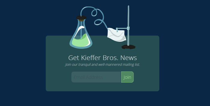
A section of the Kieffer Bros. website that encourages visitors to join the mailing list. An illustration shows an erlenmeyer flask with a tube feeding into a paper envelope held up by a lab stand.
The symbolism for a mailing list, of an envelope being fed by the brand’s logo (an Erlenmeyer flask) is quirky and playful.

More detail and color allows for more personality.

an icon of an eyedropper with various
The logo for my color tool prototype, Color Pal, changes color depending on user selections.

Icons are usually supportive to overall content. Embellished icons are a great way to add visual interest to an otherwise boring block of text.
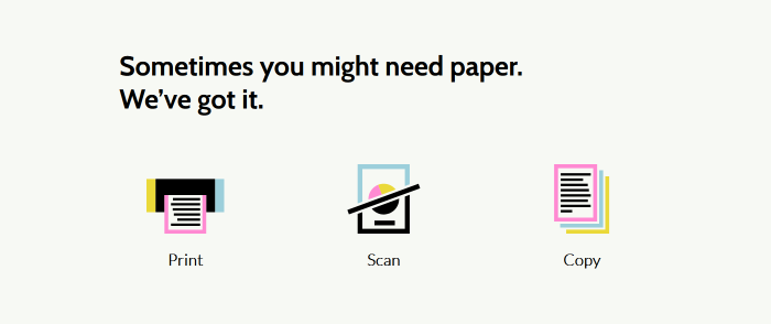
a section of website titled, 'Sometimes you might need paper. We've got it.' Below there are three captioned icons for Print, Scan, and Copy.
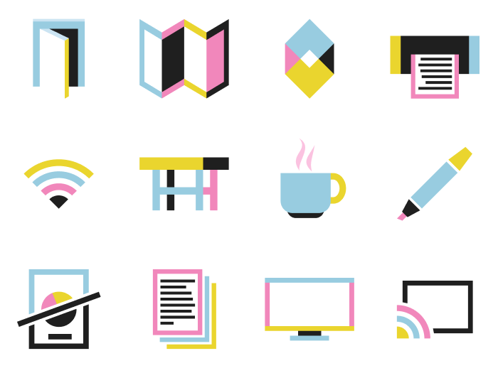
Appleton Coworking had very little photography or imagery to work with, so I created a set of color icons help breathe life into the layouts.
a set of twelve icons. Very simplistic shapes and flat colors. The set includes items related to offices, like tables, printers, wifi, etc.

Here’s another set that was used on a marketing website.

a set of six icons. Cartoonish and dimension. These icons have a surreal yet playful air about them. There is a seal of approval, a robot head, a padlock, two documents, and a map marker.

And finally, I created this set as part of a color and brand exploration.

a set of three icons. A hand receiving an envelope, a document being scanned, and a rocket ship midflight. These are highly stylized using unexpected colors, and overlapping simple shapes for the objects they are depicting.

Posted September 10, 2023