Deposit Tracking
Case StudyThis particular product handled check deposits for our customers—a very useful service for businesses that are forced to deal with paper checks on a regular basis. Unfortunately our customer service team was often getting hit with a very simple question from our customers: “Where’s my money?”
We had a transparency problem in our process. Although our operations team was excellent and efficient, the wildcard was that our service also relied on banks and delivery companies for completion. This led to customer confusion and lack of confidence. Our team burned time dealing with this question simply because our product was not transparent. It was costly for the business, but more importantly, frustrating for our customers.
Concept
I kicked off my design sprint with a team brainstorming session. Bringing the team together at the start gave everyone—engineers, product folks, etc.— a chance to weigh in. This helped build team consensus, and made sure we were going to be building something we all believed in.

We came up with the idea of using a timeline to show customers exactly what was happening with their money — similar to the Dominos pizza tracker or the Amazon package tracker. This idea was appealing because it would show the current status AND show specifically what was to be expected next.
After our session I wrote a design brief that included design tenets that I would uphold throughout the process. Transparency was key; customers should always understand exactly what is happening with their money, and we should always do our best to set realistic expectations at the outset.
Getting Specific
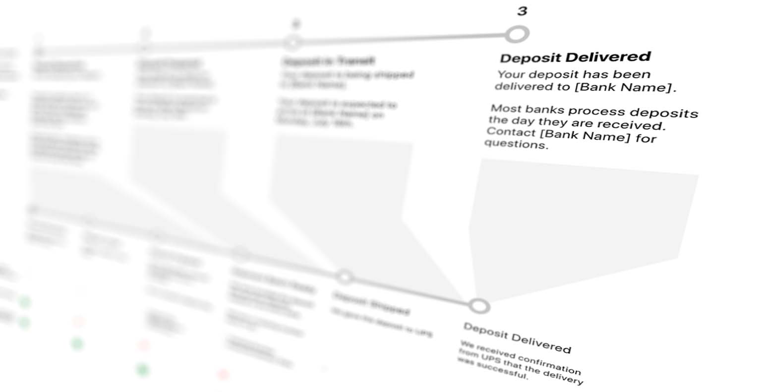
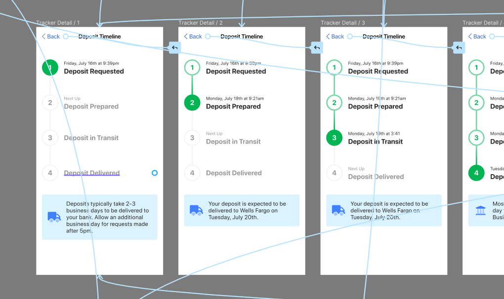
With the timeline concept as the cornerstone of our solution, I needed to identify the key points in the deposit process that would be meaningful to the customer. These needed to map directly to operational milestones for this to be technically feasible. I decided a 1:1 mapping was unreasonable because there were too many details that would not matter to our customers. I narrowed it down to four points that each had their own unique piece of information.

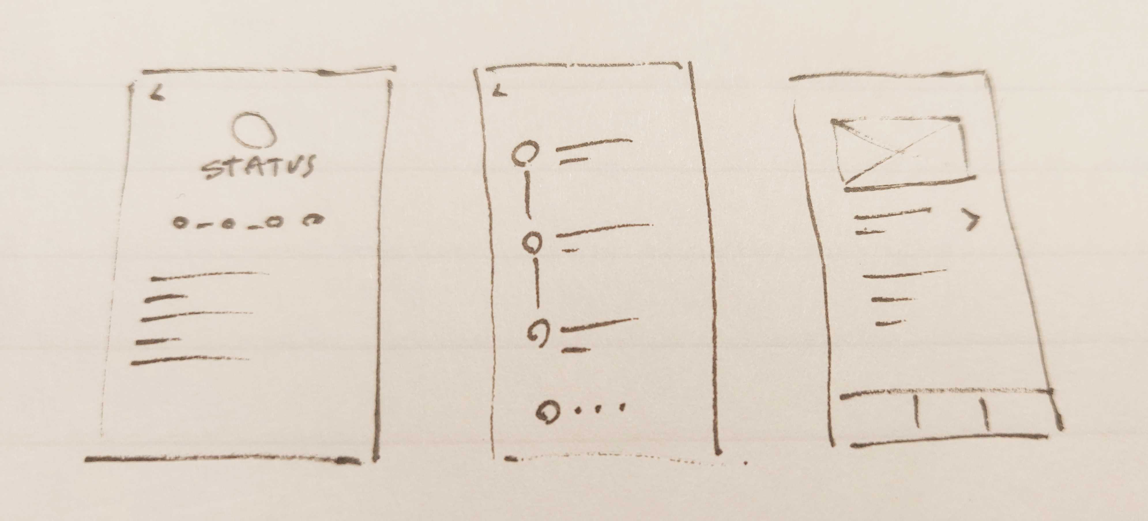
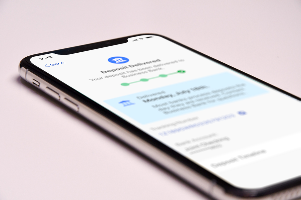
I then put together some wireframes to review with my team. From this point we were satisfied this was the right direction, and I started building a high fidelity prototype. I took a mobile-first approach, and designed for our iOS app.

Validating Solutions
With a high-fi prototype in hand, I was ready to test it with real people. I used a service called Validately to rapidly test the prototype. The tool allows you ask screening questions, like “Does your business receive checks in the mail?“. It was important to test with the right group of people, and because this is a service for handling checks, we wanted to make sure this would be tested by people that could actually use the service.
Usability testing is great for telling how easy or difficult it is to complete a task, but beyond this we also wanted to make sure that we were solving the initial problem. This problem was deeper than just a question of usability, but more so a perception of transparency— were we giving customers enough information about their deposits to feel safe and secure? My test involved several tasks all based around depositing and checking the status of the deposit, but importantly I asked a series of followup questions to get at the heart of how transparent and comprehensible the process was.

After analyzing the test results, I felt confident that this was a good solution for our customers. It was time to build it.
Measuring Success
We launched this feature to our customers, and the outcomes we are tracking for success are largely based on customer feedback. We specifically are looking for a reduction in customer support tickets and negative complaints from other feedback channels. Because we validated our solution we are confident this new feature is setting clear expectations from the outset and providing greater transparency throughout the process.

Posted October 23, 2020