Blockwick 2
Game Design
Blockwick 2 is a critically acclaimed puzzle game published on Steam, Google Play, and the Apple App Store. I was the product designer behind this project and was mainly responsible for UX and visual design. I also contributed to the game design, music, and some development.
Concept
We knew from past experience that releasing a game with too much difficulty up front can be disorienting to customers and discourage them from playing through to the end (and potentially from buying additional puzzle packs). From the beginning, we decided to take a more intensive approach to user testing to ensure that we kept our audience engaged (user retention), thereby increasing chances for sharing and eventually purchasing more puzzle packs. Our aim was to walk the line between too easy (boring) and too hard (frustrating).

Research
I began by gathering data from our previous games on conversion rates compared to puzzle progression difficulty and user retention. In previous games, we always made an effort to have a smooth difficulty progression but had never conducted user testing to optimize player enjoyment and retention. Although we received excellent customer reviews for our previous products, our conversion rates and user retention were not stellar.
I also started looking into other successful games to suss out the positive encouragement given to players to keep going. Two things were very clear, the more successful games relied less on text-based tutorials and more on subtly guiding players to “discover” concepts on their own. Once concepts were firmly established, the games let players wade into the deeper waters of difficulty. Many other successful titles also embraced the concept of "just-one-more" — making it easy and compelling to continue on.
Plan
Before building puzzles, we mapped out a logical progression plan, introducing more complex concepts later and graduating the difficulty. I designed a user path that made it frictionless for players to move from puzzle to puzzle with a single tap. I also developed a clear, visual progress-tracking system that incentivized players to keep going.
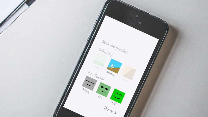
To finish the planning portion of my process, I crafted a micro-survey to be built directly into the beta version. This would give us realtime feedback of players’ satisfaction and perception of difficulty.

Implement
To implement our plan I worked with our other game designer to build a large number of puzzles, following our progression roadmap as closely as possible. I worked with our developer to build the survey UI that would be presented after each puzzle. With our developer, I also worked to set up which metrics we’d track to get a meaningful picture of how the game was being played. We decided to monitor the amount of time it took players to get through a puzzle, the number of moves they made, where they gave up, and their total play time.
Test & Iterate
We then launched the beta. We knew one hundred and sixty puzzles would take quite a while for our testers to complete, so we kept the beta open for several weeks. Keeping it open this long allowed us to get a fair amount of data.
The next task was pulling it all together for analysis. After compiling all the data, it became very clear which puzzles were too easy and too difficult. We removed some puzzles and reordered others, but overall our progression was pretty good.
The most glaring problem we identified was that one particular mechanic was very confusing to people. We were seeing a disturbing drop off rate around the time this mechanic was introduced as well as negative feedback from the user surveys. We used this insight to rework how we taught the mechanic, going more slowly and giving players more time to master it. We also replaced many of these puzzles with new ones that had simpler solutions.
Conclusion
Equipped with solid data, we were able to confidently implement all these changes knowing that we were releasing a solid, user-tested game. After its release, Blockwick 2 received very high user ratings, and went on to get featured by many prominent companies including Starbucks, Amazon, Apple, Time, and a host of other review sites. Another positive effect was that Kieffer Bros. saw almost no customer complaints — a notable difference from previous product launches where we'd often hear from players that were completely stuck. Overall user testing throughout this project was a really important part of creating a great user experience. It contributed to a successful launch of Blockwick 2 and solid user retention.

Posted May 30, 2017